API Usage (Part 1)
OpenSource
- No personal information stored on file.
- Payments made exclusively in BTC.
- OpenSource is not responsible or liable if you are charged criminally.
In this section of the smartphone project, we are going to set up and use the Random User API from RandomUser.me. It is a very easy to use API that does not require any authentication, api keys, or headers which makes it perfect for a nice little project like this one
As a note, you may notice throughout the project that I used the term "Target" instead of Developer. Initially this was supposed to look like a "Job" or "Hit" app that you would find in a video game but I found it to look a little problematic. The code "under the hood" will appear as I had it, but the actual viewable text will be changed to accomodate these changes.
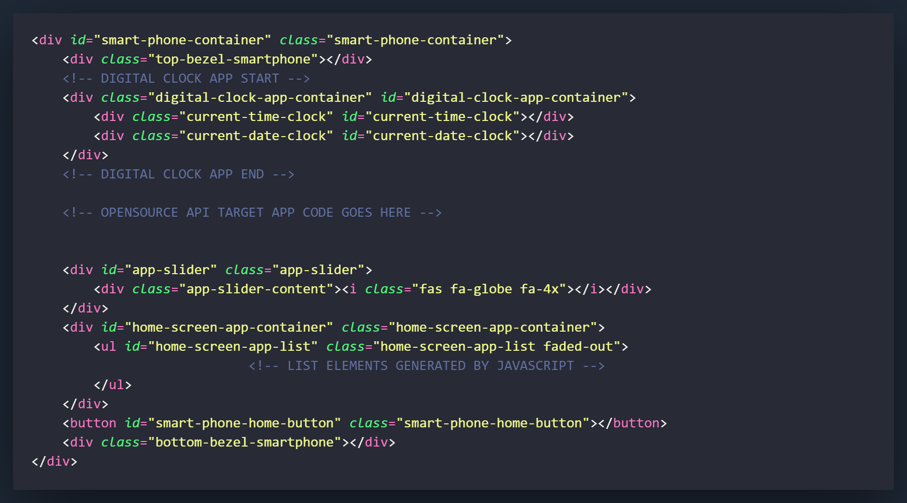
There will be several blocks of HTML that we will have to code for this API app. One that serves as a type of "Landing Page" for the app, one that will appear when the search is being ran, and one that will load when a developer in the area is found. These 3 will all be housed in a div that will be completely cleared and rebuilt when the user clicks the home button.
I have marked the location in the HTML where we would like to place this code.
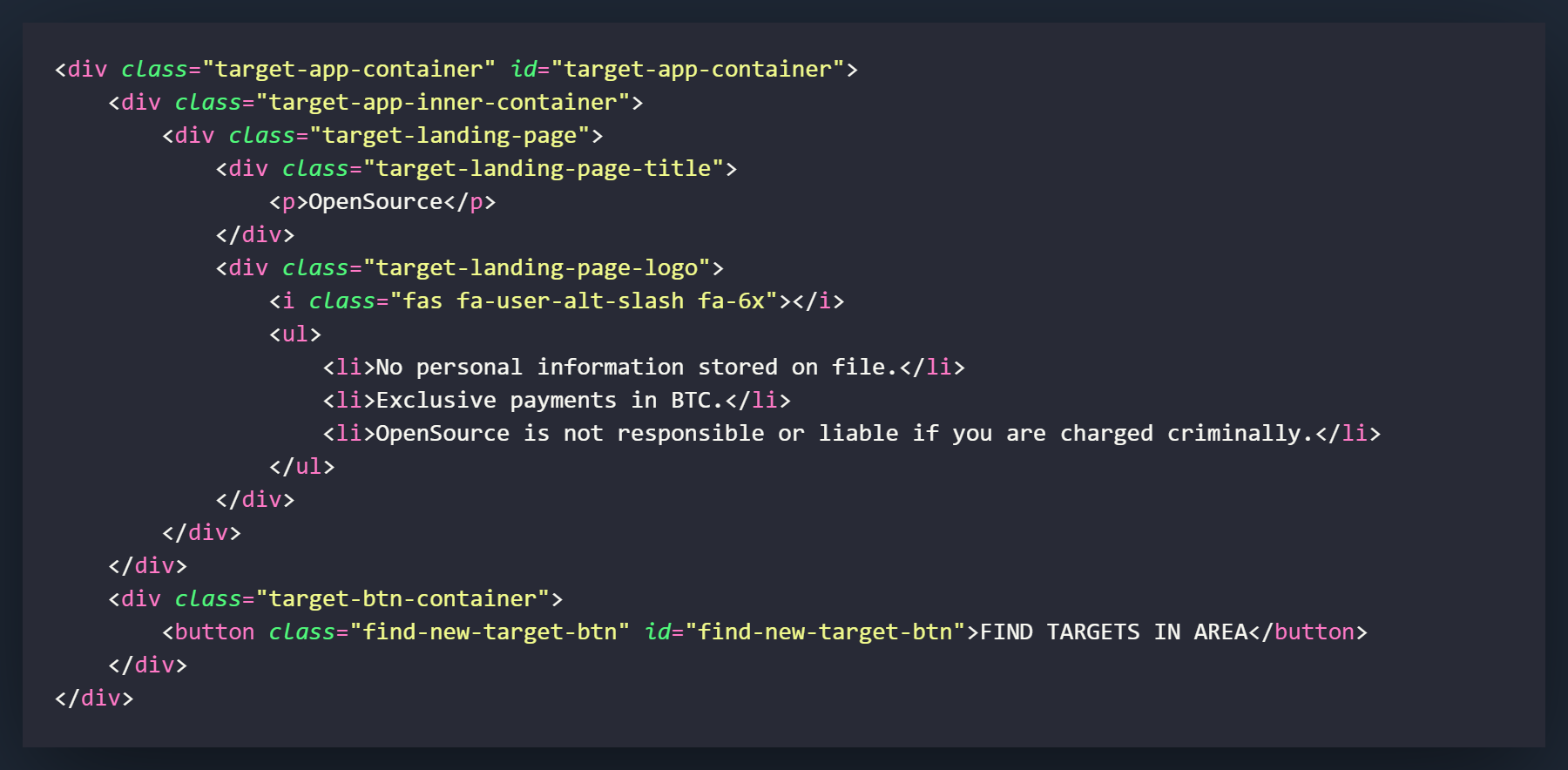
The first thing we will create is the div that we will call the target-app-container. This will have both a class and an id of target-app-container, and will house all of the elements of this project. Inside this div we will have 2 other smaller containers that will contain the 2 main areas of the app.
The first area of the app will be the target-app-inner-container. This will be the mini-container within the app that will change as we interact the various sections. It will initially contain the "landing page" and change as we initiate a search.
The second div will be the target-btn-container. This container will contain the button to initiate the search and will stay static throughout the apps usage.
Inside the target-app-inner-container div we will have a div called target-landing-page and will be the first thing the user initially sees when they call up the app.
Inside the target-landing-page we will have 2 divs nested inside. The first will have the title of the app that can be called anything you would like. The second will contain a logo for the app, I used an icon from Font-Awesome, and an unordered list that contains a disclaimer about the apps usage. These can also be changed to anything you would like.
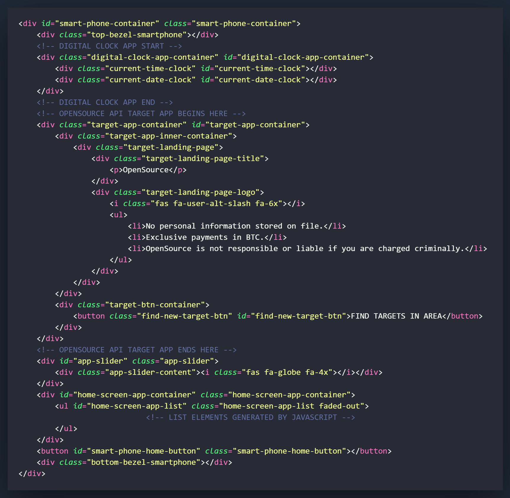
Above is how the code should appear when it is added to the existing HTML.
This will be all of the HTML that you will need when the app is initially loaded. More sections will be added in the inner container in the following sections.
This is a very CSS heavy project, with many elements to style. In this part of the tutorial, we will style the containers and landing page. The search and results page will be covered in the next two sections.
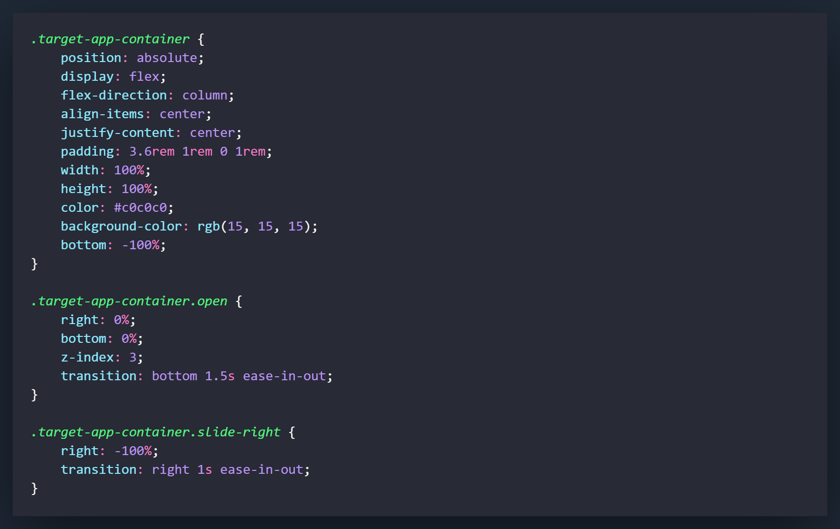
The .target-app-container class will be the first element we style. It will be holding all of the data for the app and will also be the container that will be moved when the app is opened and closed.
We will start our styling with the standard .target-app-container class. Most of the settings are for how the other information will be positioned within the div. The 2 most important attributes for this class would be the setting of position to absolute, and bottom to -100%. These settings will allow us to unlock the elements and position them below the smartphone on the X-axis. There is another setting we can use to achieve this (translateY()) but we will cover that in a future tutorial.
The next class will take effect when we add a class of .open to the .target-app-container class. When this class is added, it means that the app has been opened and the container will slide from it's location of bottom: -100% to bottom: 0%. We will also set the z-index attribute so we layer this over all of the elements on the screen. In this class we will also set the right attribute to 0%. This will be changed when the next class is added.
The .slide-right class will take effect when it is added to the .target-app-container element. It will change the right attribute to -100% and slide it out of the display.
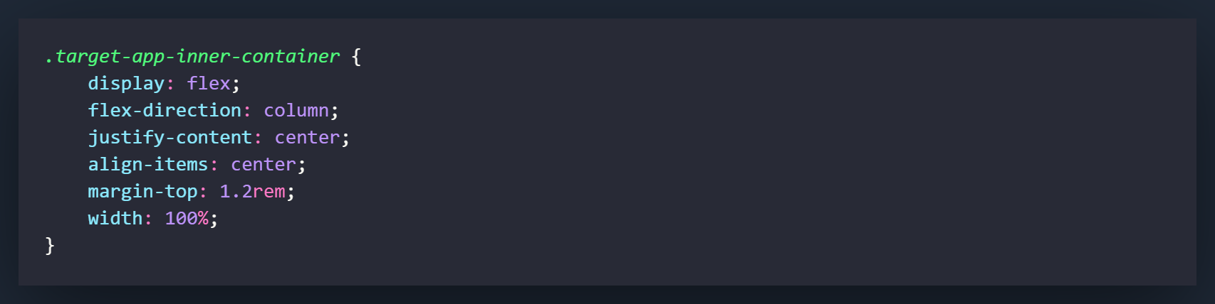
The .target-app-inner-container class will be what styles the part of the app that will change as searches are made. These settings are all used for styling and positioning.
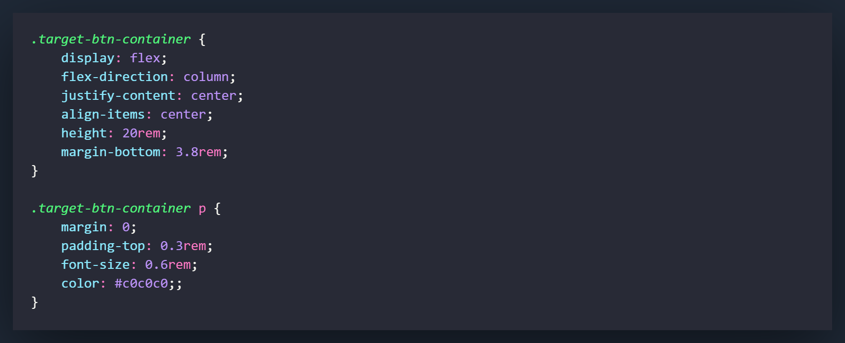
The .target-btn-container is what will be holding our button. We want this div to stay static and not grow and shrink if content is added to outside elements. The best way to accomplish this when nested inside a div with a flex-direction of column is to set a height. This will allow it to stay static at it's current size and not move to accomodate anything else.
.target-btn-container p will style the paragraph element inside of the .target-btn-container.
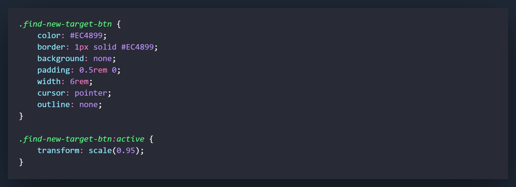
Now we will style the actual button that will be clicked to initiate searches within the application. Regular buttons by default, can be pretty ugly. The first thing you want to do is strip away the default styling elements and replace them with your own. Where this will become apparent in our settings is how we set the background attribute of the .find-new-target-btn class to none. If we did not do this we would still be given the default style of the button.
The class of .find-new-target-btn:active will cause a change in the split second that the element is clicked. The transform setting will cause the element to shrink slightly to mimic the physical motion of a button being clicked.
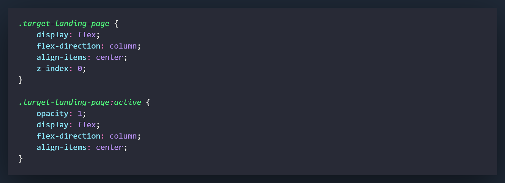
The .target-landing-page class will style the first page in the .target-app-inner-container when the app is opened. It will contain a section for the app title, a section for the logo, and an unordered list with some of the apps fine print.
.target-landing-page:active will only be used to change the opacity of the element when it is added. In the screenshot I kept some positional elements in there but you only really need the opacity attribute.
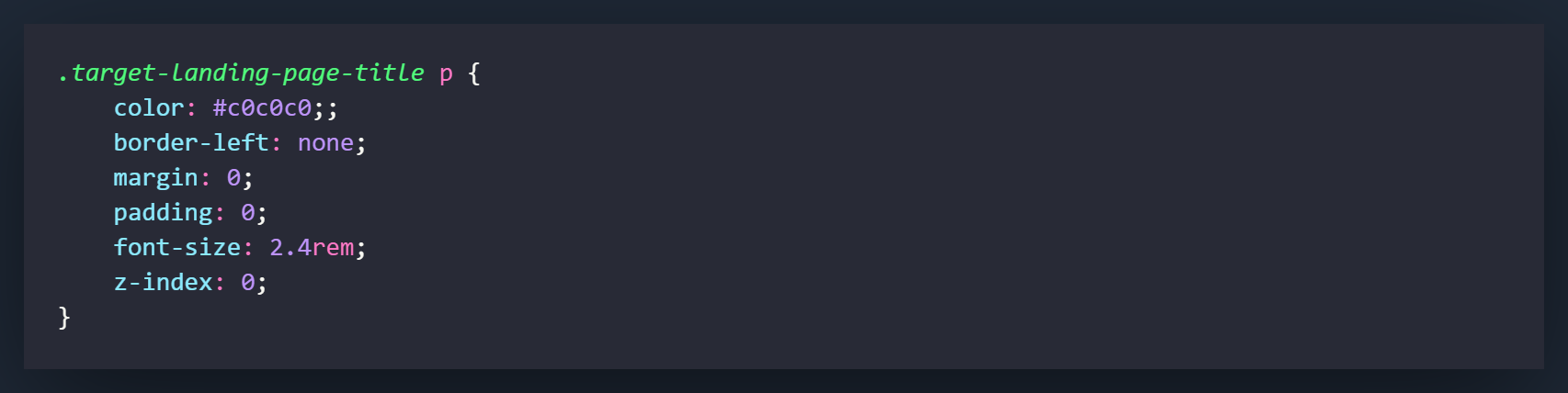
The .target-landing-page-title p will be used to style the paragraph element contained within the class div. It is used for styling and sizing of the title element.
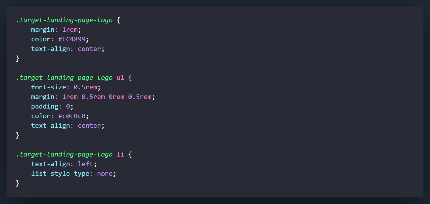
These classes are what will be styling the sections that contain the logo and the unordered list on the landing page. The logo is actually a font-awesome icon so the sizing is controlled through the inline-styling in the HTML code.
All of the settings in these 3 classes are used for positioning and styling and can be changed however you would like. The one I would consider the most important and the one to remember, would probably be setting list-style-typeto none. This will remove the bullet points from your list items.
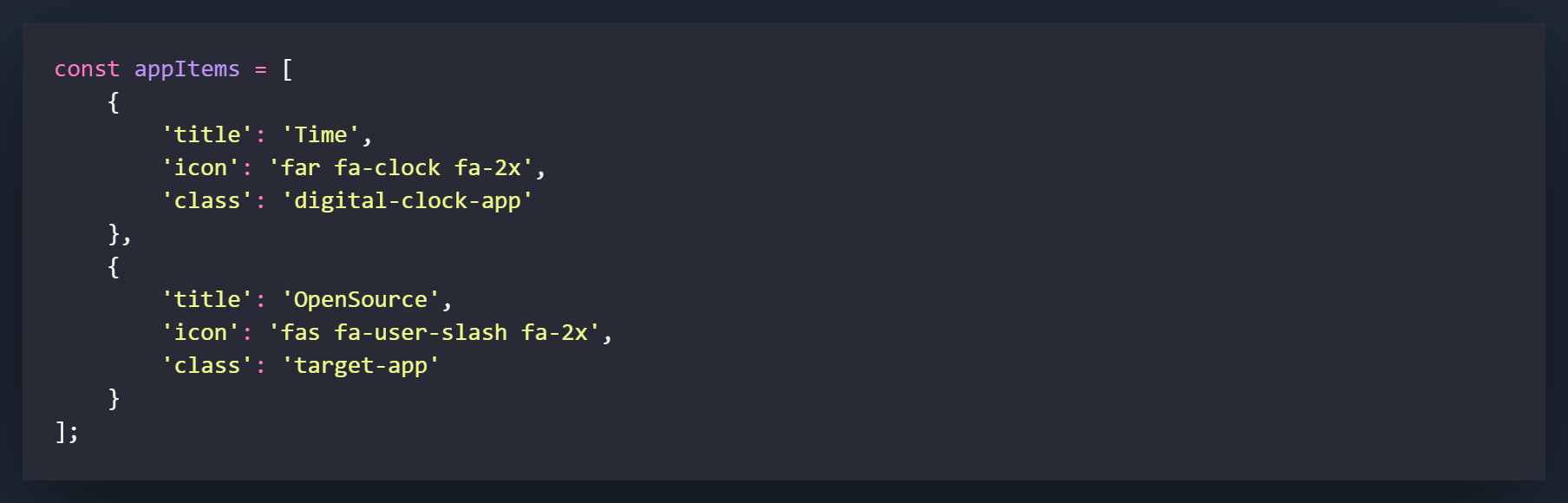
The first thing we want to do is add a new object to our appItems array for the new app/icon that we will be adding. Fill in the necessary information, but most importantly make sure the class matches because that's what we will be using to open the application when it is clicked.
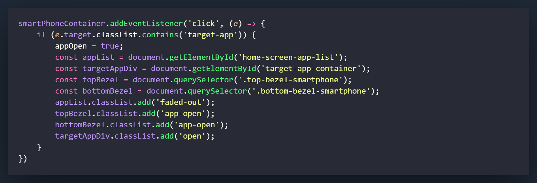
To access the app we are going to use an eventListener that is very similar to what we used to open the Digital Clock app.
On the first line we will listen on the smartPhoneContainer that we made a variable for in the Digital Clock section. Make sure you pass an event into the function (e) so we can use it on the next line.
Now we want to use an IF statement to determine that whatever we click on contains the class of 'target-app', by using the e.target.classList.contains('target-app') method. If the new icon on the homescreen does (which it should if you went through the digital clock app section of the smartphone project), it will run the following lines of code.
The first line will change the appOpen variable to true to let the script know that an application is currently open.
Perhaps the most important of the next settings is adding the class of open to the targetAppDiv variable. This will cause the element to activate and slide up on the Y-axis into the screen.
The remaining lines are exactly how we had them set in the digital clock app section. We will be creating variables and adding classes when an app is open.
appList will cause the icons from the homescreen to fade out, top and bottomBezel will cause the pink borders to appear on the bezels.
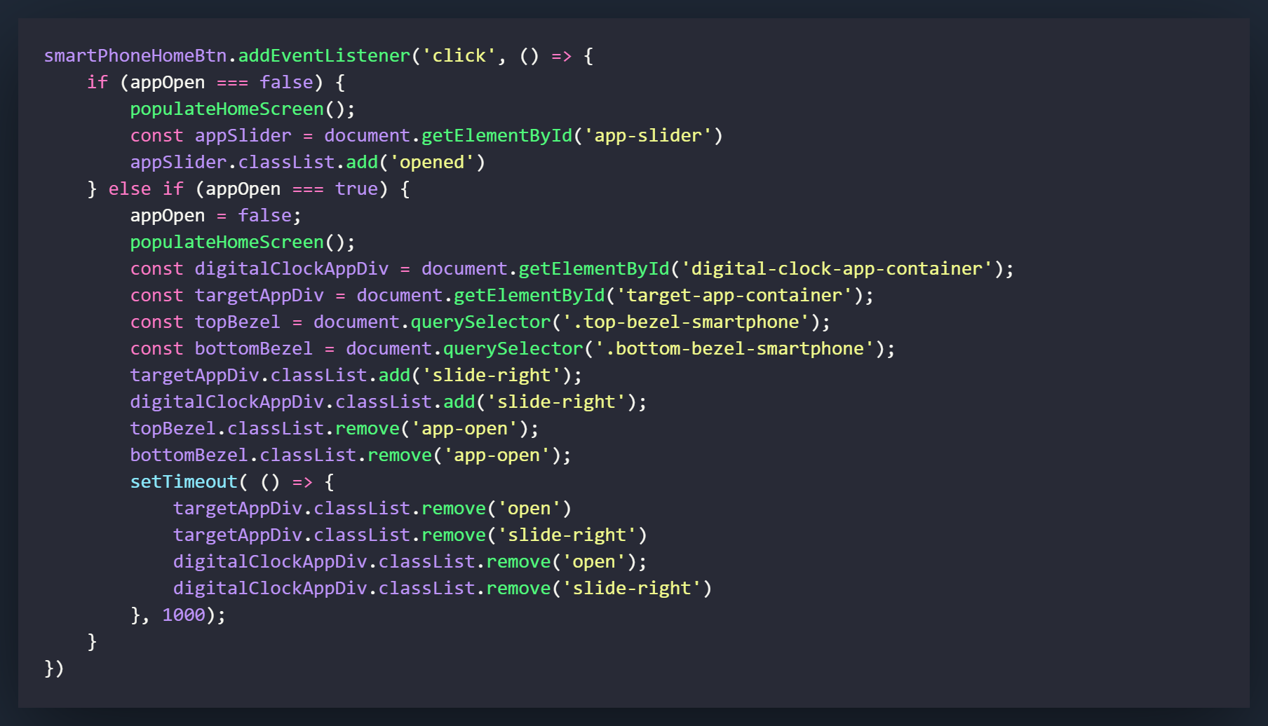
Now we will add the code that closes the app by pushing the home button. We have already coded most of this thanks to our Digital Clock app, all we need to do is add in our variables for our new application.
In the ELSE IF section, we first need to declare a variable for the 'target-app-container' by using getElementById. Once this is completed, we can add and remove the classes to the element to remove it from the screen.
Add all of the lines that are related to targetAppDiv. Changing these will result in the element sliding out to the right and then being returned to its default position on the Y-axis under the smartphone.