Build a Home Screen
In this project we will be focusing on building the smart phone home screen by using a few JavaScript functions that are very widely used in DOM manipulation.
The first will be creating an Array of objects, the next will be creating an element and lastly we will go over appending that element to the DOM.
If this is your first time looking at this it can be a little confusing, but with time it will become much easier to understand.
Let's go!
The very first thing you will need to do for this project is to link the "Font Awesome" stylesheet to your HTML. You can either go through Font Awesome or you can head to CDNJS and copy the LINK tag on the first selection. Place it in the HEAD section of your HTML.
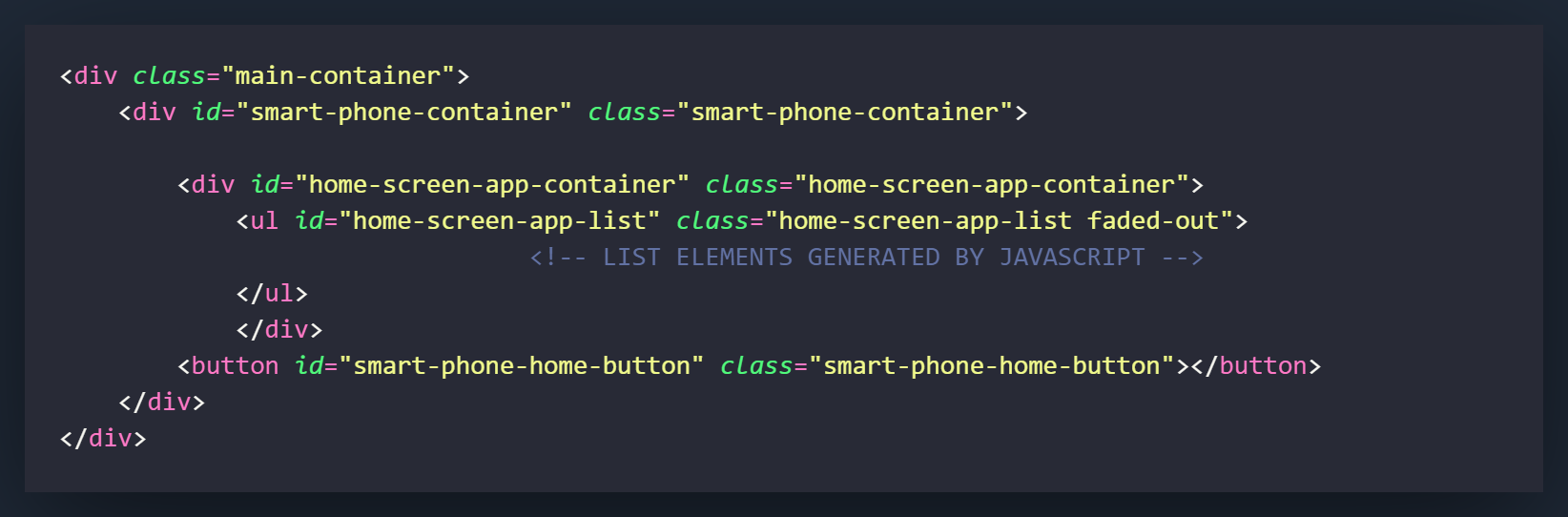
The first thing you will want to create is the main-container. This will serve as the container that will hold everything and center the smartphone layout on your screen. You may need to play around with the CSS settings a little bit to customize it however you would like.
The next element that we will be adding is the div with the id/class "home-screen-app-container". It will be placed inside the "smart-phone-container" but will not serve as a container for the "smart-phone-home-button."
After this we want to create an unordered list element [ul] and give it the id/class of "home-screen-app-list and a class of [faded-out], place it inside the "home-screen-app-container" div." Generally we would want to put our list items [li] in here but we will be generating those through the JavaScript and appending them to this UL parent element.
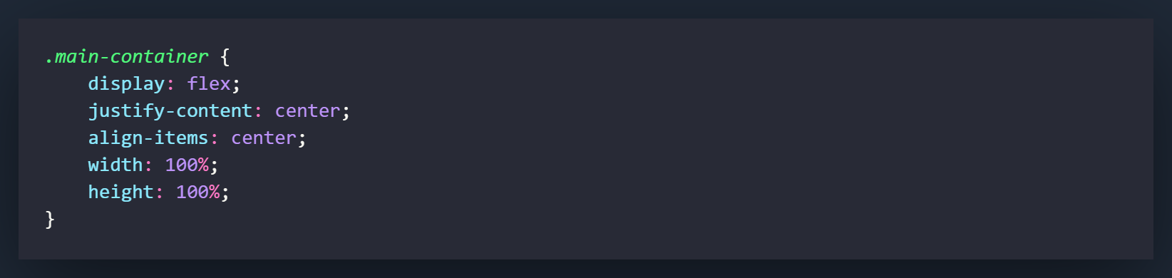
This is the window container for the project. It basically will center everything on the page. You can customize it however you would like (background-color, etc)
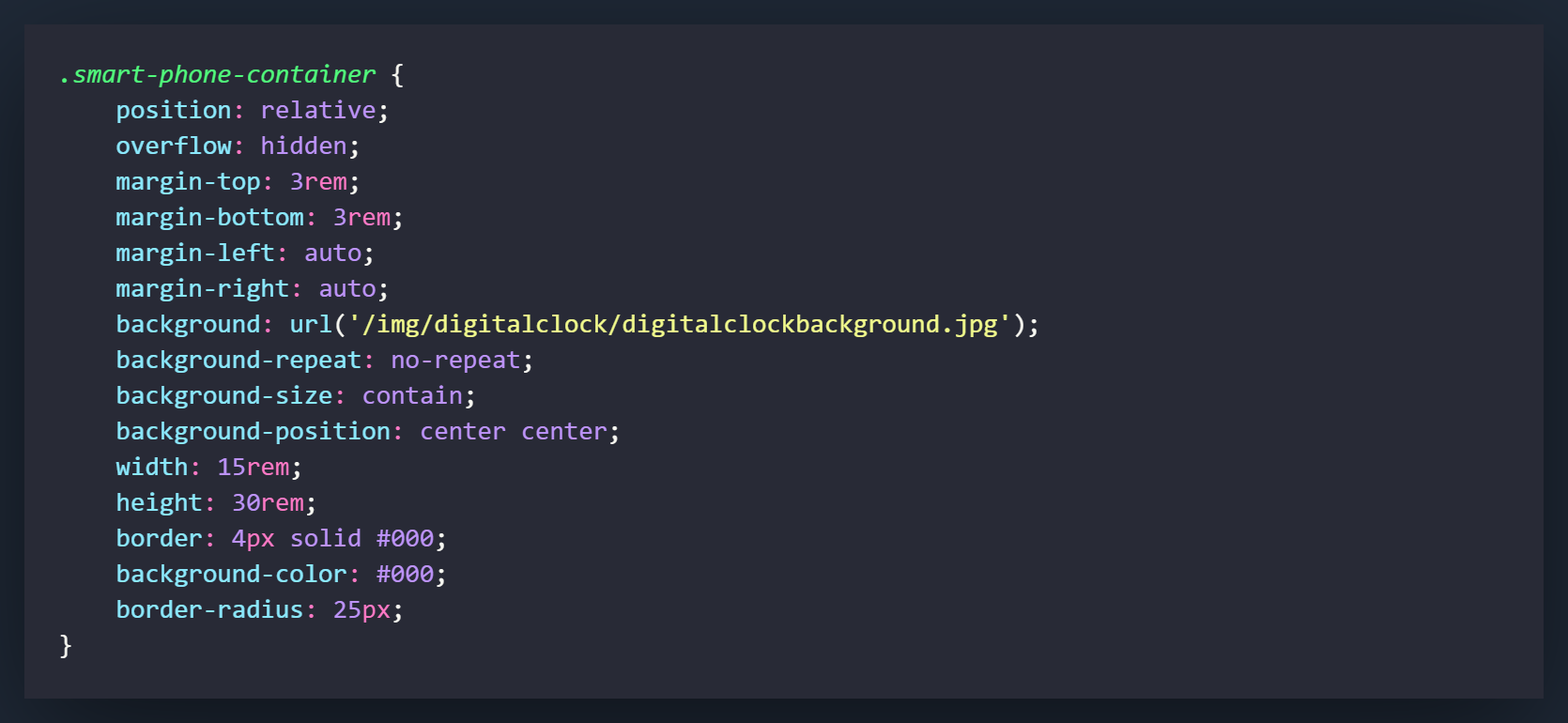
This is is the main container for the project that makes it look like a smart phone. It will hold the other divs and components you will be using for the project.
The very first thing you should set is the position of the div. The position of relative is like telling the browser that other things are going to be put in here, and it will be used as the footprint of where those things can be situated.
Set the overflow to hidden so anything that finds it's way outside of the div will not show up in the browser
The next 3 things were for the margin in my project. They basically just give you some space and center the container in the div above this current one.
The background settings are all pretty standard. The background is linked to a URL that will use a photo as a background instead of a color. If you would like to download the exact picture I used, you can grab it here on Unsplash. You can also use any picture you would like but I suggest using one that has a portrait orientation
The other background settings are used for positioning the background in the div. The most significant one is having a background size of "contain." Generally you would like to use "cover" but we would like the full picture showing to get the effect of the smartphone in this project.
I have set the height and width here. I tend to use REM because I have been told that it is better for accessibility over pixels. I do believe it is also more responsive.
The rest of the settings are for detailing. If you're not aware yet, border-radius is what gives you those nice little rounded edges you see on every button on every single website.
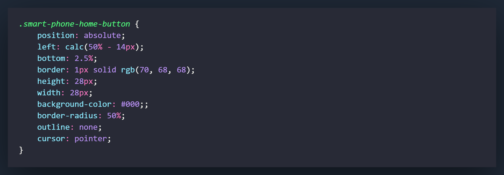
The ".smart-phone-home-button" is the round button that exists... well used to exist on every single smartphone. In this project, pushing it will pull out the time bar. Generally it would bring up the home screen but hey, I needed something to work with.
The first thing you need to do is set the position to "absolute". Think of a position of absolute as unlocking the element to move around wherever you want on the page. By default it will set itself to the top left corner but with a few settings we can put it wherever we would like.
What I recommend doing first is setting the width and height of the button. This will allow us to calculate the absolute center of the div (if you would like to place the button in the center). You can pretty much put it anywhere you want by playing with the percentages in the next steps.
The left setting is how far we will place the element from the left side of the parent div (.digital-clock-container). The "calc" measurement is a little hack that allows you to find center since 50% will give center the left-most side of the button and not the center of the it. What this does is takes the 50% measurement and then you want to subtract half of the button element's width. Since you set it at 28px in the last step, you would cut that in half and minus 14px here.
The bottom measurement is how far off of the bottom of the parent div your button will sit.
The rest of the settings are used for styling. You may have noticed that I removed the outline (accessibility folks are fuming at me) but this is something we will look at in an upcoming step. I promise, this will be accessible!
Cursor pointer makes the little pointy hand appear when you hover over the element. Do not underestimate how much this is needed!
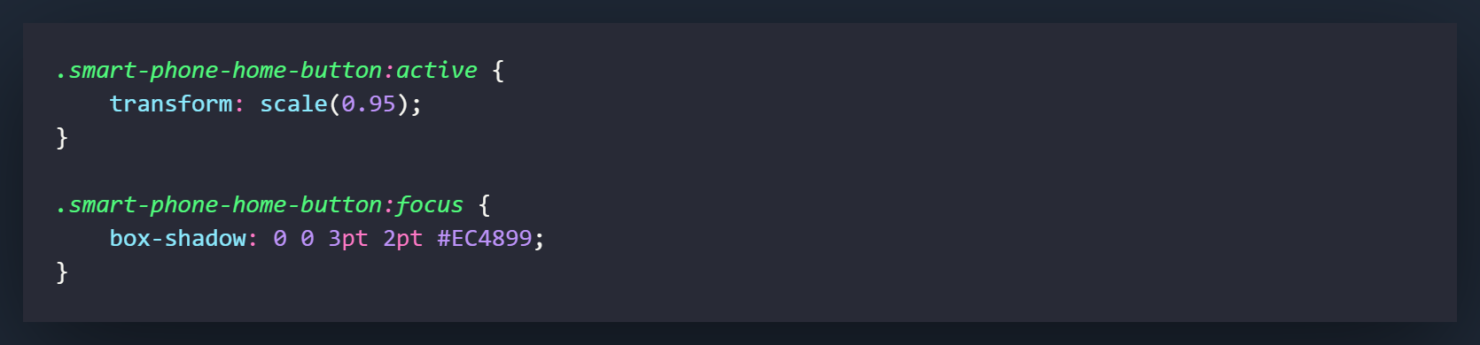
[.smart-phone-home-button:active] || This next little CSS trick I cannot take credit for. I 100% stole it from Wes Bos (who also has one of the best courses for learning JS called JavaScript30 available for free on his site!). What this trick does is scale the button that you click down just slightly to give it the appearance of being physically clicked.
[.smart-phone-home-button:focus] || Alright! I told you I was going to make the button accessible. When you have an outline on a round button, it ends up being square and there is no way to adjust the border-radius. Using box-shadow will accomplish the same thing as outline but you can make it round. Add some styling and you got yourself a slick looking (and accessible) button!
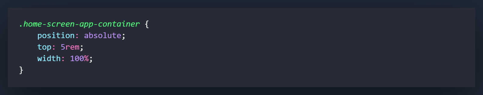
This will be the container that holds all of the app items. Since it would stick up into the bezel of the smartphone, we will set the position to absolute and bring it down 5rem from the top. Set a width of 100% for it takes up 100% of the width of the smartphone container.
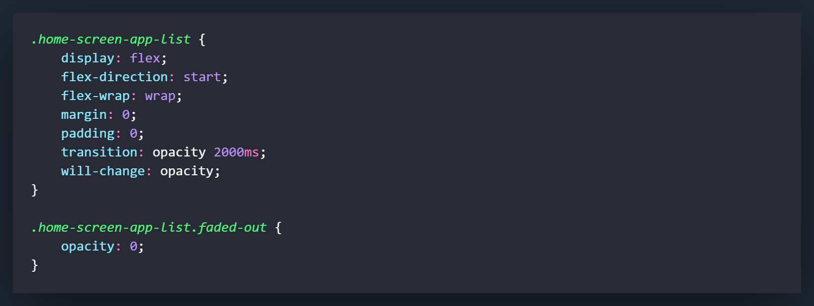
The [.home-screen-app-list] is the unordered list that we are going to populate with LI items from within the JavaScript. Set the display to flex. Instead of justifying the content to the centre, we will use "start" to mimic what the a smartphone default actually does. Flex-wrap will cause the icons to move down to a second line when they can no longer fit on the current one. The transition setting will bring the opacity back to normal when the next class [.faded-out] is removed from the UL. The will-change setting should only be used if you notice a performance issue with the transition. By default I would remove it and if you notice a performance hit, you can re-add it.
The [.faded-out] class will be applied to the [.home-screen-app-list] by default. You have already added it to the HTML and we will be removing it with the JavaScript. This will create a fade in animation of the icons. You can change the duration to whatever you would like in the class above this one. I have set it at 2000ms by default.
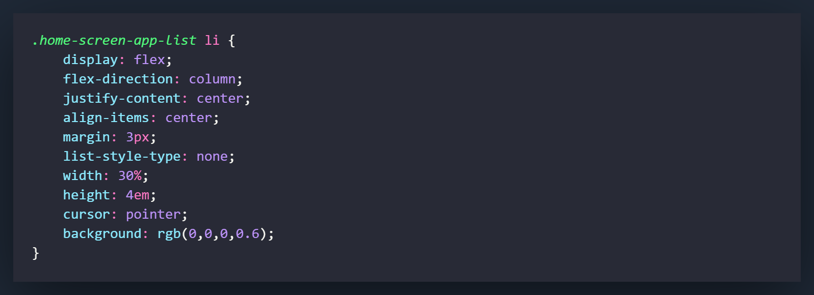
These are the settings for the list items that are going to be generated in the JavaScript for the unordered list. There is nothing too out of the ordinary here. Flex settings are used for centering, the background has some added opacity so the you can see through them, list-style-type removes the bullet points.
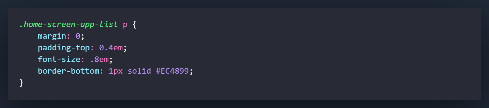
Also pretty straightforward. The paragraph tags will house the name of the icon when we generate them in the JavaScript. You can play around with the settings here if you would like it to look a little different once it's generated.
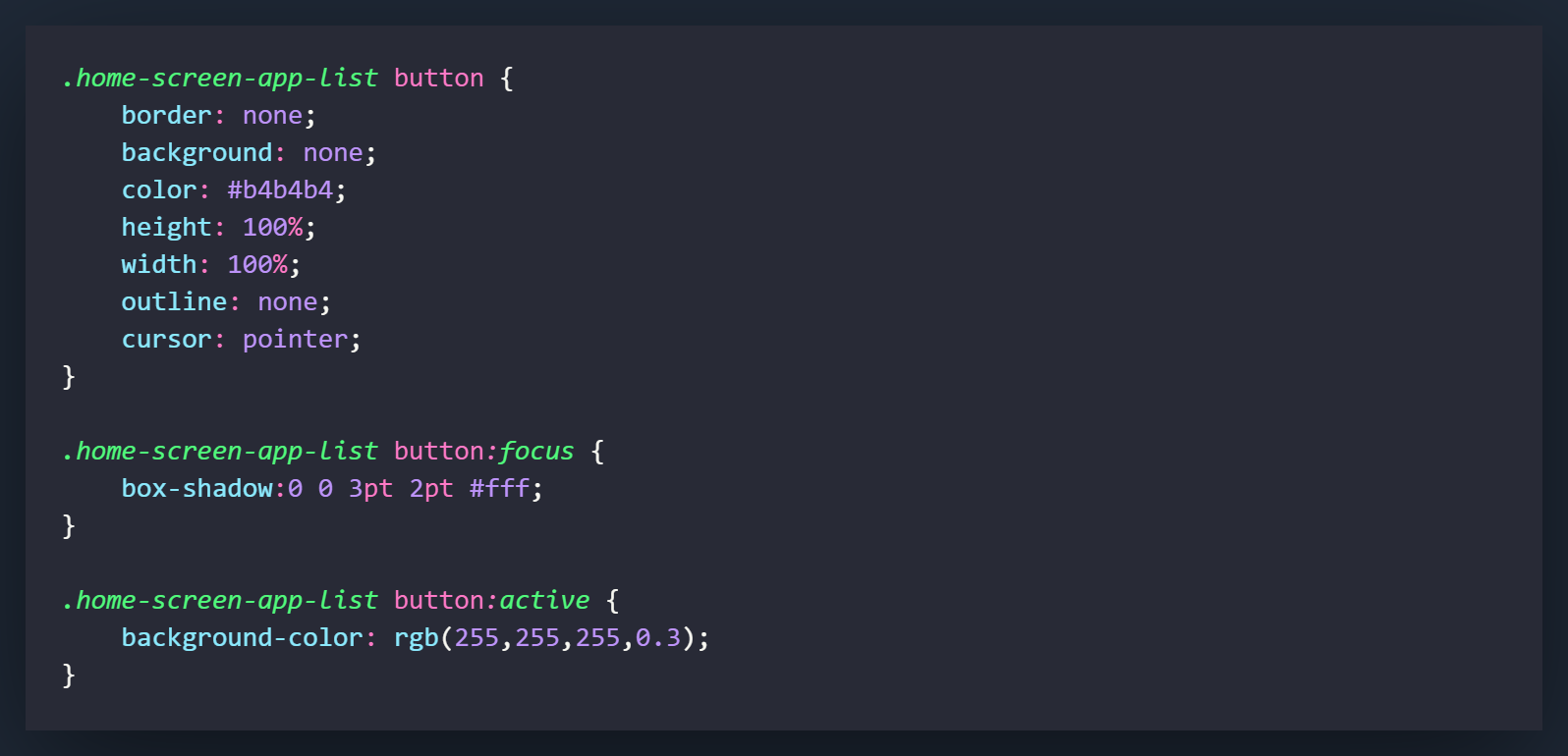
I actually came back to this tutorial and changed some of this due to accessibility. I hadn't used buttons for the app items, but felt like it would be much more accessible if I did. It was a little more work but I do think it paid off with some of the benefits using buttons gives you. Besides the sizing, most of the settings here are used for effects when the button is clicked. You can play around with the settings in the focus and active state if you want a different color or size.
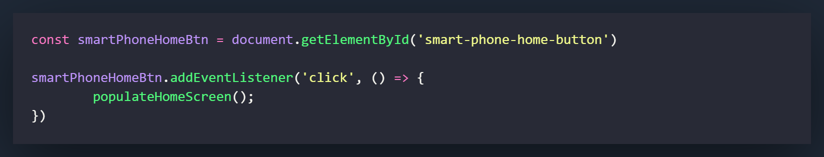
The first thing we would like to do in the JavaScript is declare a variable for the "Home" button. I called it smartPhoneHomeButton and it is grabbed by using [document.getElementById('smart-phone-home-button')]
After declaring the variable, let's put a 'click' eventListener on the smartPhoneHomeButton variable and that leads into an anonymous function. Within the anonymous function, let's call a function called populateHomeScreen( );. This function has not been created yet, but it will contain the code to add our list items to the DOM.
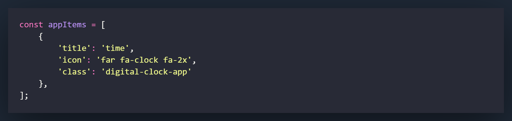
Now scroll above the eventListener and let's build an Array that is going to contain the information we will need for our App Icons. As you can see above, we only have 1 object currently in the array but as we get further along into the project, we can add more here as we need them. We will be grabbing all of this information with the use of template literals in our next step. The title is what will populate the paragraph field for the app Icon, the icon is the font awesome classes that are needed to create the icon, and the class is the class we will want to add to the list items we are creating. These will be used later to open up each separate application.
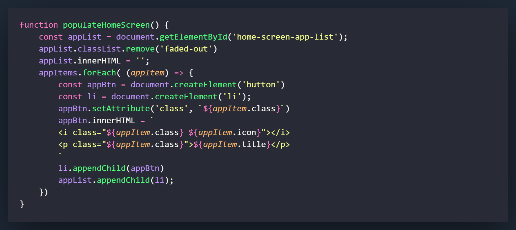
Now we are going to build our populateHomeScreen( ) function. I will go through it line by line.
First you want to define your function. Call it populateHomeScreen( ) since that is what we called in the eventListener.
Now let's assign our unordered list to a variable called appList by using the id of [home-screen-app-list]
Remove the class of [faded-out] from appList. In case you forgot, in the HTML we applied this by default to the unordered list and in the CSS we set the class settings. This will cause us to remove the class which will then cause the element to fade in in 2000ms (This was my default, you may have changed it)
Now let's set the innerHTML of appList to a blank string. This makes it so that if you click the button more than once, it clears out the unordered list before it is repopulated. This just prevents multiple of the same elements from being added with multiple clicks.
Now let's use a forEach on the array that we created. What a forEach will do is apply a function to each and every object within the array. I have defined each item here as [appItem]. What this means is that as it goes through the array it will assign each appItem a number and that number will apply to that object. What we are going to do in this project, is grab the different elements of each array object and use them to fill out our list items. For example, on the first pass through the forEach function, we will be given the title, icon, and class of the time object (which is first and only object). If we had another object in the array, on the next pass through the function, it would give us that information.
The first thing we will do in the function is create a [button] element. What this variable will do is tell the DOM/document to create a button element and assign it to the variable of [appBtn]
Next we will create another element but this time it will be an [li] element. This list item is what will be appended (added) to the parent element, which in this case is the unordered list that is linked to the variable appList
Now we will set the class attribute on the [appBtn] variable. The first item in the brackets is what attribute we would like to set and the second is what we would like to set it to. By using backticks, a dollar sign and a set of curly braces, we are using what is called a template literal. This allows us to access the array/object that we are currently going through and pull out certain items. Let's say this is pass through number 1, this would give us access to the items in the first object. Which means ${appItem.class} will give us a class of 'digital-clock-app'
Next we would like to change what is contained within the innerHTML of the appBtn
The first line will change what Font Awesome icon we will use, and also apply the class that is stored in the array to the icon. This will be used when we open up the application by using querySelecter in an upcoming tutorial.
The second line will add the class stored in the area to the paragraph element and apply the title stored in the array to the paragraph content.
Now are are going to append the [appBtn] to [li]. This will make [li] the parent element and [appBtn] the child Element.
Now we are going to do something similar with the [li] element, but this time it is going to be the child and [appList] is going to be the parent.
The appendChild method is one of the most widely used methods in DOM manipulation and if you can get a decent handle on using it, it will make your Vanilla JavaScript experience much better.
So that is it! You should be able to click the home button on the smartphone and have the Time icon appear on the screen. Now that we have this set up, we can start adding other components and functions to the project.