How to make a Hamburger Menu
DEVELOPERS IN DEMAND
The tech boom of 2099 has brought with it many challenges, but perhaps the most challenging of all is keeping up with the demand for skilled developers.
The hamburger menu!
Ever since development started targeting mobile devices, the hamburger menu has become the most used element in terms of navigation. It doesn't take up much space, and everyone knows that when you click on it more things will appear. However to web devs that are somewhat new to JavaScript they can be a little intimidating. Trust me, when I made my first one I think I spent 4 days trying to figure it out on my own. However, once it clicked, it clicked (and brought a lot more knowledge with it.)
Hopefully this tutorial will ease you into it and explain it in a way that makes sense. After completing this, I do feel that many people that are new to JavaScript will feel much more comfortable with building one on their own.

The very first thing we will need to do for this project is to create a link to the Font Awesome CDN so we have access to their icons. If you have an account you can use that, or you can head to cdnjs and grab the style link from the first option.
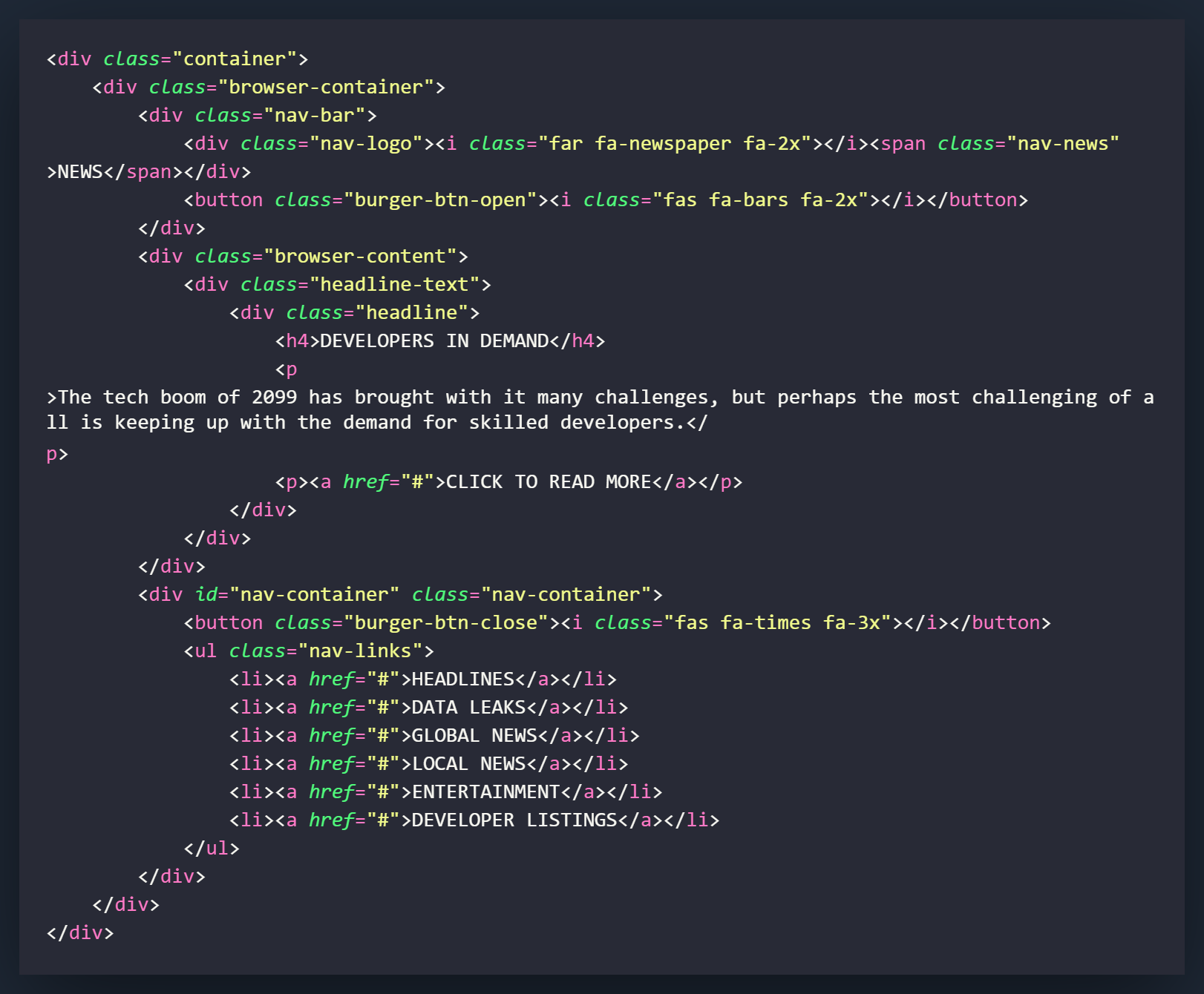
We will start by creating a div called .container that will contain all of the code for this project. Everything else will be created inside of this div.
Now we will create the .browser-container div. This will be the main containar for the browser look that we are going for. From this point forward, we will start sectioning out the divs inside of this one to create the different elements of the page.
Inside of the .browser-container we will have three separate sections. One for the navigation bar up top, called .nav-bar, one for the main section of the browser called .browser-content, and one for the navigation overlay called .nav-container.
We will first start with the .nav-bar div. Inside the navigation bar we will create a div that will house what is used to create the logo elements, and a button that will be used to activate the navigation overlay.
Now we will move to the div with the class of .browser-content. This will contain the main content for the page. It consists of a single div with the class called .headline-text and has another div with the class of .headline nested inside of it.
The .headline div can pretty much be filled with whatever you would like but you will need to style it accordingly in the CSS.
Lastly, we will create the .nav-container div. This will the overlay that slides up when you click the burger menu button. It will contain a button to close the menu and get back to the main page, and an unordered list of links that on an actual site would take you to the other pages. In our tutorial will we use a # in the HREF as a placeholder.
That will be all of the HTML for this project! If you are planning on implementing this in your own project, you can add and remove things accordingly but I would wait until we go through everything so you can tweak the look of everything with the functionality.
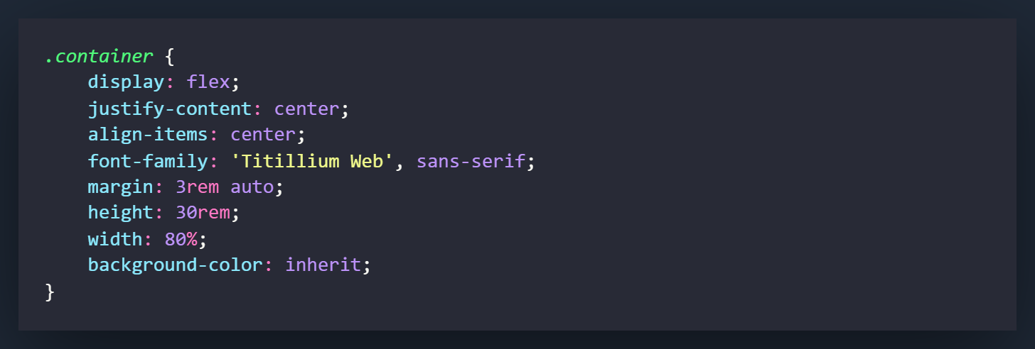
We will start with styling the .container div. Many of the attributes and settings in this div will establish the positioning for the project. Set all of the flex attribute settings to center everything vertically and horizontally on the page.
What you may want to change here is the font. I chose to use Titillium Web but you can import anything you would like from Google to use in its place.

Now we will work on styling the .browser-container. This div will serve as the actual browser in our project. It will be what all of the other components work with, and the container that our overlay will slide into.
Set the position to relative so we can establish it as the footprint of the project. We can now set elements to absolute and they will be based off of this div.
We are going to set the overflow to hidden but I would highly recommend commenting it out for now. When you see how the components work, it starts to make much more sense. Leaving the overflow visible will allow you to see where the overlay exists outside of this div.
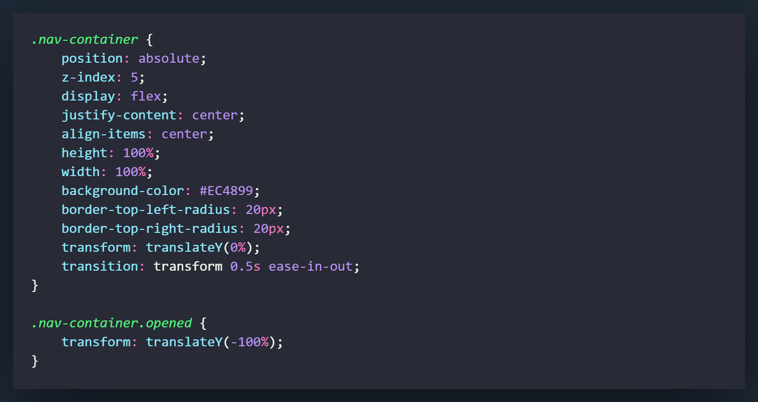
These next few sections are the fun part of the CSS. This will be the overlay that slides over the browser and populates your screen with your navigation links. I personally love this style of hamburger menu navigation because it let's you let loose and style a cool page without feeling confined by the page's content.
First set the position to absolute so you can freely move it around inside of the relative positioned container.
Set the z-index attribute to 5 so that the overlay will exist over everything else within the browser. Think of it like throwing a blanket over top of everything else.
The next settings are all used for positioning and the look of the page. This will center everything, round the top corners of the div, etc.
The transform setting is going to set what we want to change when we activate the opened class. In this case we will want the transition to take effect when we transform the translateY(0%) setting.
The .opened class is what will be added when we click the hamburger menu icon. It will cause the translateY(-100%) to come into effect, cause the div to slide up to the 0% position. This will allow the navigation overlay to cover the browser div.
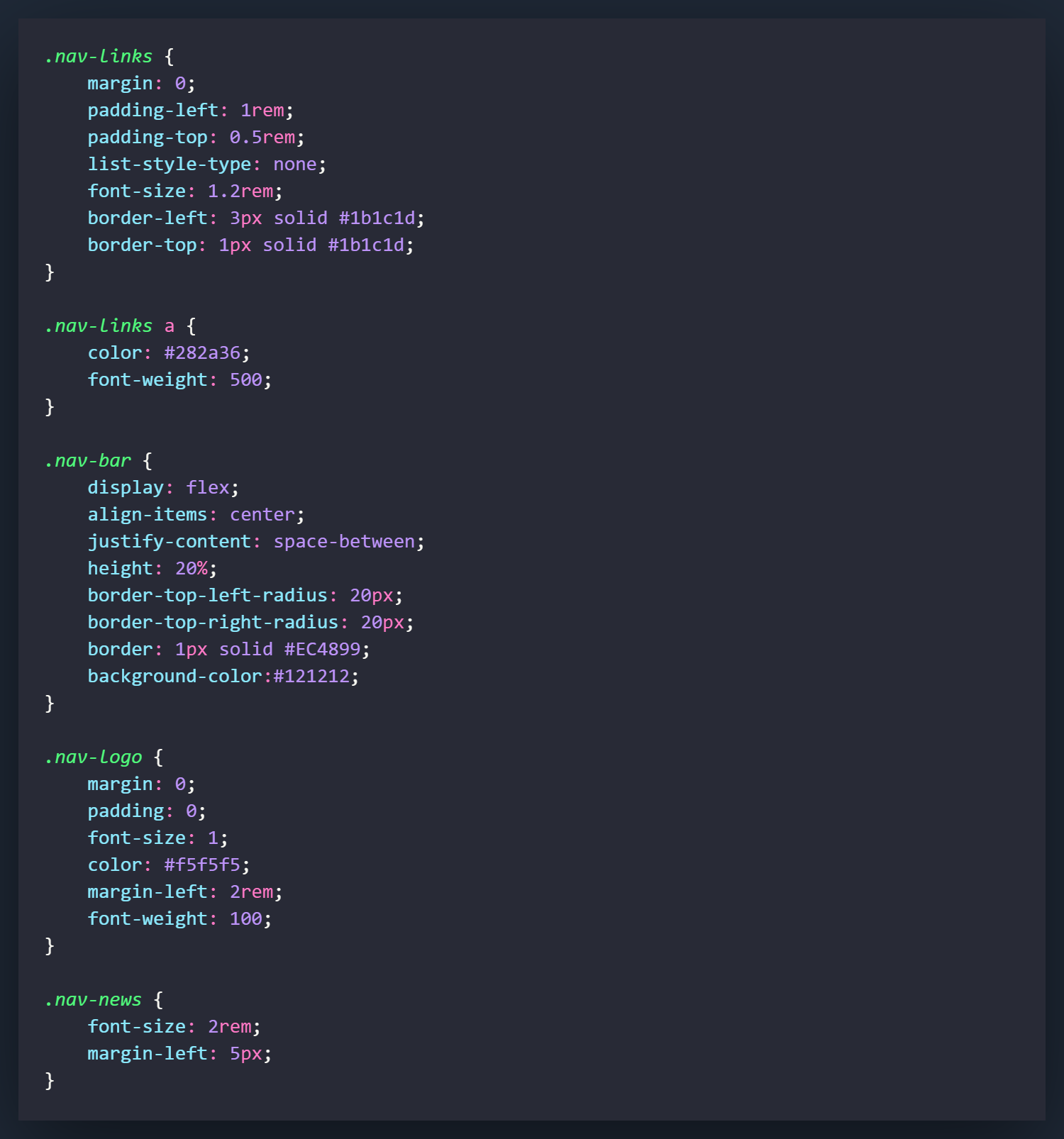
All of the above classes are mostly all used for styling purposes on the navigation overlay and in the navigation bar on the browswer. It's all pretty standard settings.
The one thing that may be new to some, would be the space-between setting for justify-content in the nav-bar. This basically states the elements will have space will be distributed evenly between them. The first item will sit flush with the starting edge of the container, and the last item will sit flush with the ending edge of the container.
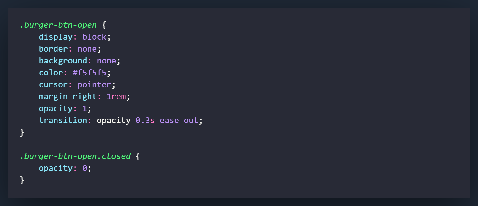
This will be the button that exists on the browser that will be clicked to open the navigation overlay. The only setting that is not used for positioning here would be the opacity and the transition on the opacity. When paired with the .closed class, these settings will cause the button to fade out when it is clicked. It doesn't really effect that function of the button but it does make it look a little nicer.

This is the X button that will exist on the navigation overlay to close and slide it down. With the position of absolute set, the right and top attributes will allow you to position the button wherever you would like. In this case we have set the button 32px from the top and 17px from the right.
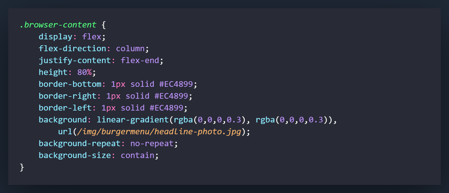
The .browser-content is the main section of the browser that containes the photo and headline for the article. If you would like to use the same photo, you can grab it here. As you can see from the settings here, I used a background image for the background rather than using an image. I feel this allows you to create something much more responsive, rather than using an image that will never fully adapt to all of the different screen sizes available. The linear-gradient setting attached to the background attribute is used to darken up the image slightly so it is not too bright and overpowering.
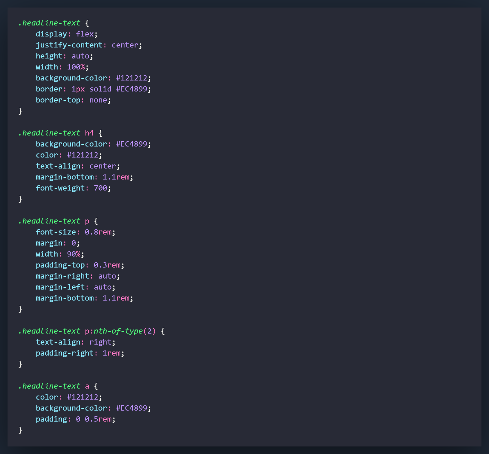
All of the attributes connected to the class of .headline-text are related to sizing, positioning and aesthetics. You can change these however you would like.
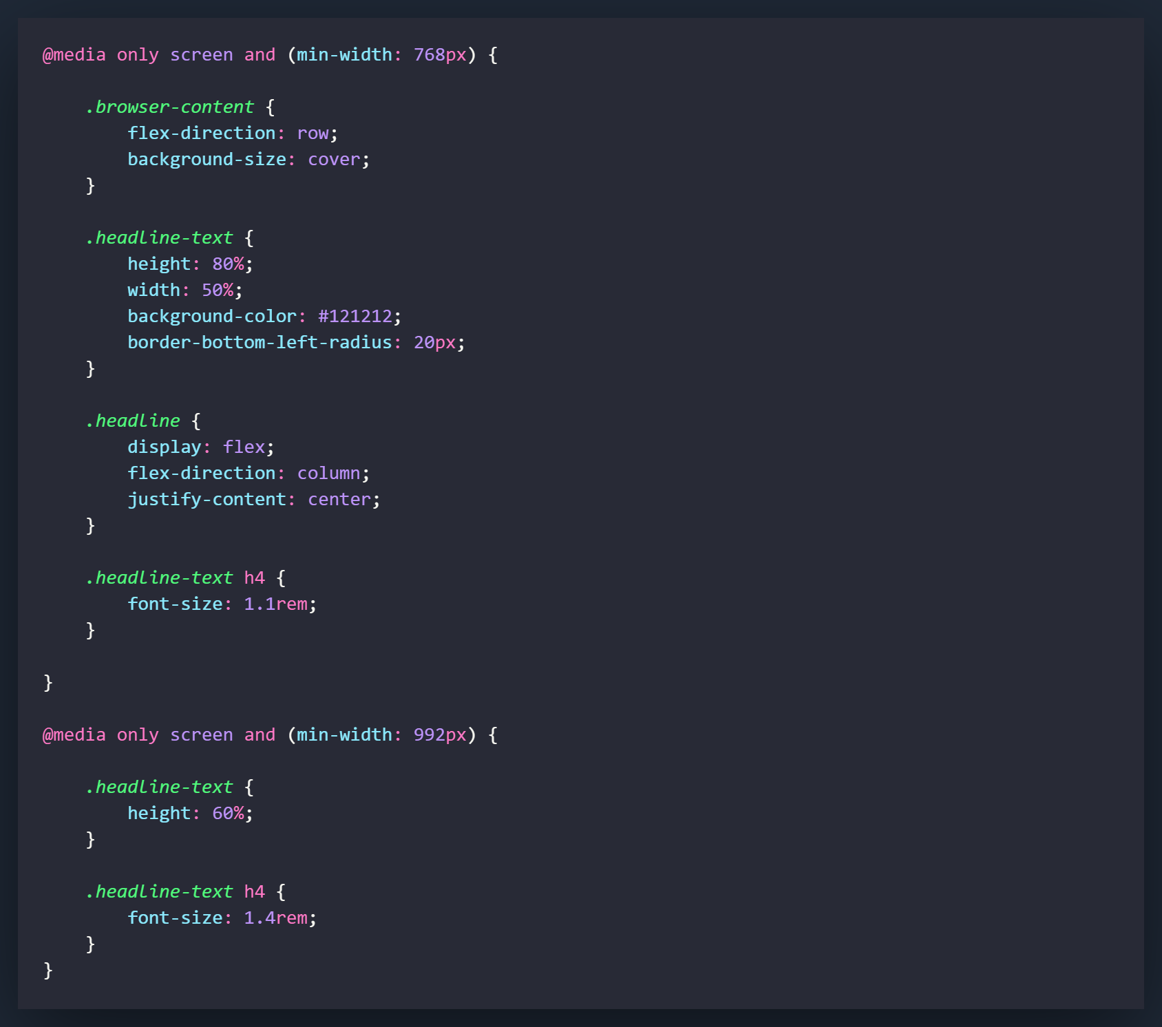
These are the media query settings I used to make things look a little better on different sized screens. All of my projects tend to utilize at mobile first approach so some of the changes need to be made to make things flow nicely on a bigger screen.
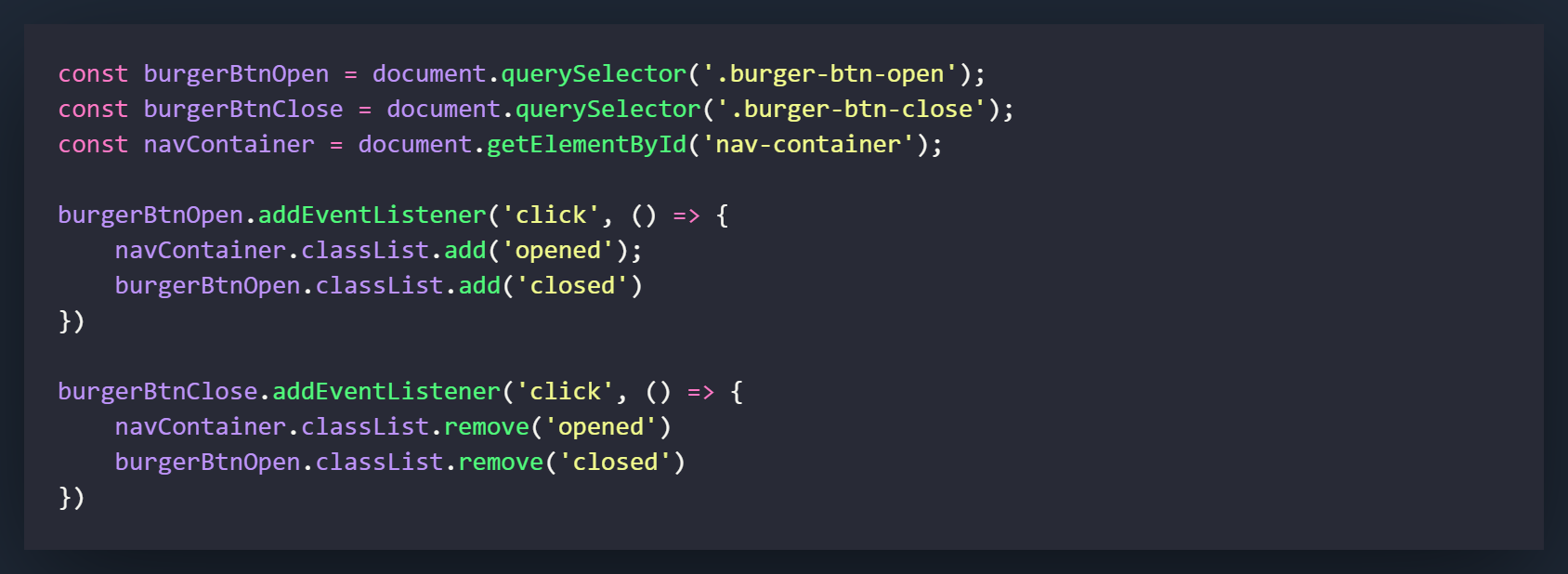
One of the best things about making a hamburger menu is how you can accomplish something so substantial without having to know much JavaScript. It is one of the better projects for a beginner coming from learning HTML and CSS to try their hand at adding and removing classes with JavaScript.
If you look at the code above, you will see that we need to grab three different elements make changes to our code. The first variable, burgerBtnOpen is our hamburger button that will open the navigation overlay. We are using the querySelector method to grab it. This means that we are using the element's class (.burger-btn-open) to access it. Note that when we access an element by their class, we need to include the " . " with the class name. The second variable is going to be for burgerBtnClose. This is the button that will close the navigation overlay when it is opened. Use the same method to grab onto this element except this time use the class .burger-btn-close. Lastly, we are going to grab onto the whole navigation overlay div but this time we are going to grab it by it's ID, since it has one assigned to it. Instead of using the querySelector method, we will use the getElementById method. Assign the variable by using the ID nav-container. Note that when you grab an element by an ID, you do not have to have a " . " before the id name.
Now we are going to add our eventListeners on both buttons. One is going to be used to open the navigation overlay (burgerBtnOpen), while one is going to be used to close it (burgerBtnClose). The way we are going to do this is by adding a class to the overlay to open it, and removing that same class to close it. Take a look at the CSS code below to see the class change that we are going to make.
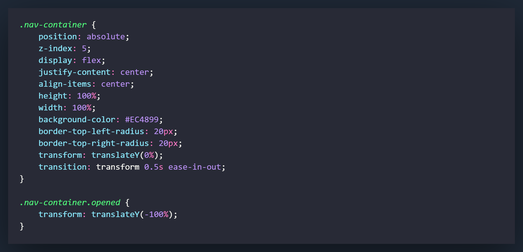
The standard .nav-container class has a translateY of 0% while the .nav-container.opened class has a translateY(-100%). What this means is when you add the class of .opened to the navContainervariable, it will cause the translateY to change and the overlay will slide up into place.
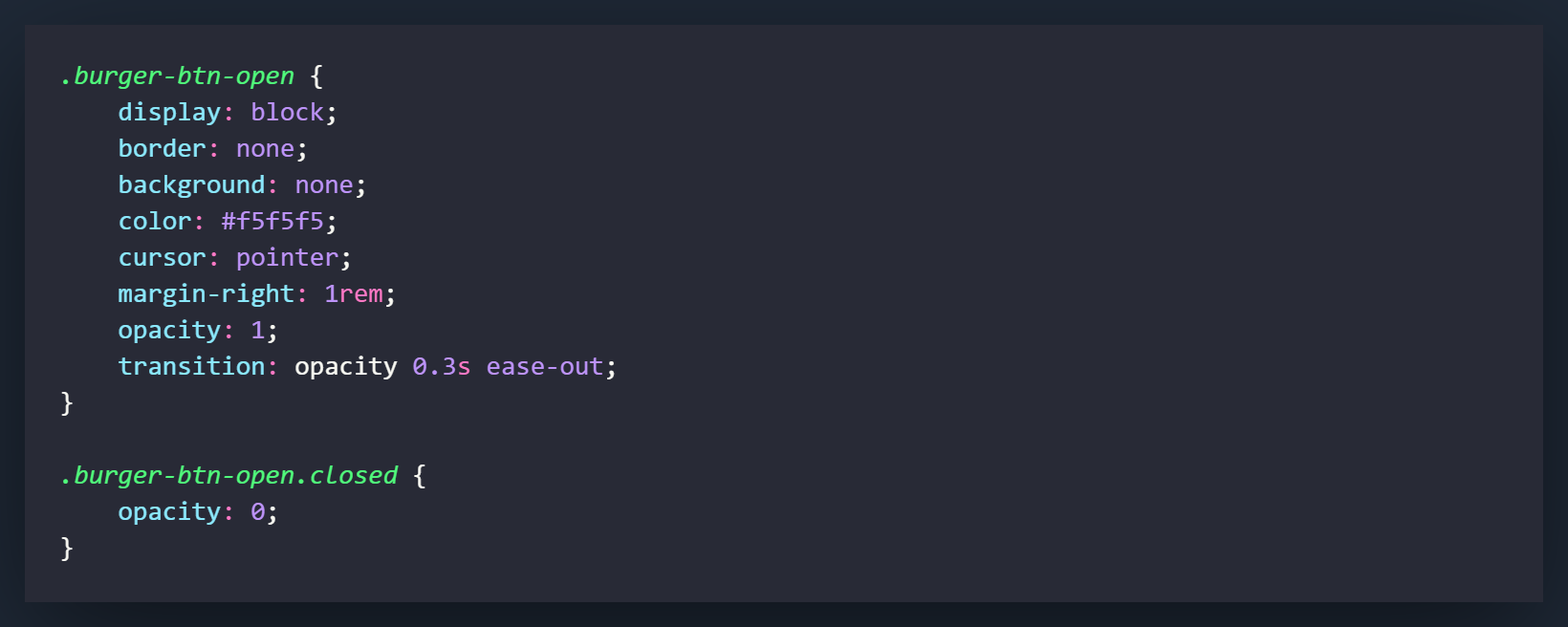
We will do a very similar thing with the opacity on the burger button. When it is open the opacity will be set to 1, but when we call the overlay, the button will take on an opacity of 0 and fade away. This is all accomplished by adding the class of .closed to .burger-btn-open.

Now let's take a look at the JavaScript code again and walk through the eventListeners. Starting with the eventListener on the burgerBtnOpen variable. We have this set to a click listener that calls an anonymous function. In that function we will add the class of .opened to the navContainer's classList. We will also add the class of .closed to the burgerBtnOpen variable. The first line of code will cause the overlay to slide up, while the second line will cause the button to fade away.
Looking at the next eventListener now. This one will be made on the burgerBtnClose variable, which is the X button on the navigation overlay. This will do the exact opposite of what the burgerBtnOpen variable did. Instead of adding the 2 classes, it will remove them. This will cause the overlay to slide down and the button to reappear again.
Wasn't that easy?
Now you will know how to create a navigation overlay but more importantly, you have learned how to modify the DOM by adding and removing classes. This is a huge part of working with JavaScript in frontend development. The more you use it, the better you will get at it.
Thank you for checking out the tutorial!